
Lausanne · Switzerland
 View larger
A compact home for student services and social life.
The project, in context
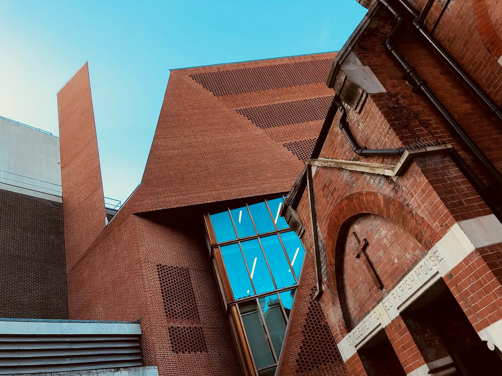
The centre opened to students in January 2014, followed by an official opening in October. O’Donnell + Tuomey designed spaces for the students’ union, cafés, learning, fitness and events within the central London campus.
What to look for
- 01
Student support and informal activity together
CONTINUE EXPLORING
Related works
Gando · Burkina Faso
Moscow · Russia
GAD / DESIGN STUDY
Saw Swee Hock Student Centre and the Work of a Crowded Section
English study · Chinese summary · · Study dated 2026-10-07
The Saw Swee Hock Student Centre gives a dense London campus a concentrated place for activities that otherwise risk being scattered between buildings. Designed by O’Donnell + Tuomey for the London School of Economics and Political Science, it opened to students in January 2014; the ceremonial opening followed on 24 October. Its significance lies in bringing everyday support, sociability and organised events into a shared architectural address. LSE project history.
The programme is deliberately mixed. LSE records early occupants including the Students’ Union, Careers, Residential Services and the Faith Centre, alongside cafés, learning areas, fitness and media facilities, a pub and an events venue. These are not interchangeable rooms. They involve different levels of noise, privacy and intensity, and people use them for different lengths of time. The architectural question is therefore how proximity can be useful without erasing distinctions between activities. Opening account.
The building answers within a tight corner site through a seven-storey section and an irregular, faceted envelope. Solid brick areas alternate with open latticework, creating a surface that can register light without becoming a uniformly transparent wall. The university’s account relates the unusual geometry to the constraints of the site. Read this way, the silhouette is a record of negotiation with its surroundings as well as an identifying mark for the institution. LSE building description.
Brick gives the several programmes a common exterior language, but its changing density prevents that language from becoming monotonous. The lattice invites a different reading at close range, when depth, openings and the surfaces behind them become apparent. A large building can thus be perceived both as a whole and as a succession of small adjustments. The useful lesson is not simply that a familiar material can make an unusual shape. It is that the same material can mediate between enclosure and exposure in several ways.
Stacking so many uses also makes movement a central design responsibility. Every shared landing or change of direction can help occupants understand what else happens in the building, but a memorable route must still support direct journeys and accessible alternatives. A student going to an appointment has different needs from someone arriving early for an event. Evaluating this kind of centre requires attention to both situations, rather than assuming that visual complexity automatically produces social interaction.
LSE identifies an Outstanding BREEAM rating at design stage and separately documents a post-occupancy evaluation. Those are different forms of evidence: an environmental assessment establishes one framework, while use after opening tests another. The building’s broader contribution is to treat student life as a substantial urban programme in its own right. Its compressed section turns the campus’s supporting activities into a visible institution, while leaving the everyday quality of those connections as the continuing measure of success.